

Publishing
A facsimile should match a documented first-edition design - not just look old. I start by checking 4 details: country, edition, printing, and jacket issue. A publication year alone isn’t enough.
Then I check how the reproduction was made:
Artwork: Was the source scanned before repairs, with changes supported by references?
Color and lettering: Do printed proofs match the documented design, rather than fading or yellowing?
Paper and printing: Do texture, ink, and any stamped details follow the original?
Binding and fit: Do the boards, spine, endpapers, and folded jacket match the source?
My rule: <u>check the source documentation and the finished book together</u>. A period-inspired cover can look the part without reproducing a specific first edition.
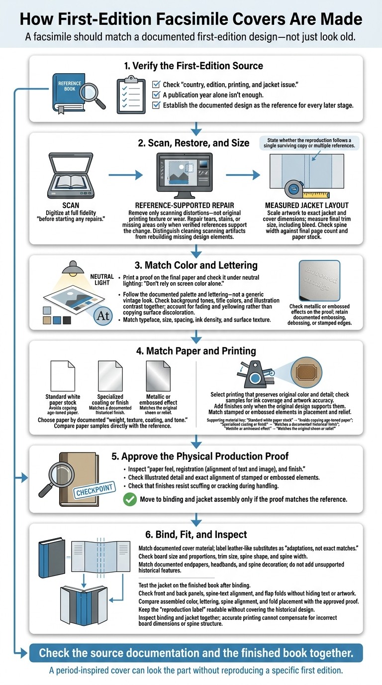
How First-Edition Facsimile Covers Are Made
Save Your Books: Live Restoration of Nutshell Library 2
Scan and Restore the Cover Art
Once you’ve verified the original cover, digitize it at full fidelity before starting any repairs.
Use high-resolution scans or controlled photography to record the lettering and artwork without damaging the original. Remove only scanning distortions - not the original printing texture or wear.
Repair Damage with Verified References
Treat wear as evidence, and separate it from features of the original printing. Repair tears, stains, or missing areas only when verified references support the change.
State whether the facsimile follows a single surviving copy or rebuilds the design from multiple references. After repairs, scale the artwork to the exact jacket and cover dimensions.
Compare Restoration Methods
Make a clear distinction between cleaning up scanning artifacts and rebuilding missing parts of the design. These are different levels of restoration.
Size the Artwork for the Book
Measure the cover and jacket panels to their final trim size, including bleed. Before finalizing the artwork, check the spine width against the final page count and paper stock.
The finalized file then moves into color matching and type reproduction.
Match Color and Lettering
Follow the documented palette and lettering - not a generic vintage look. Keep the same color balance between the background, title, and illustrations. A faded title or yellowed surface may show age rather than the original colors.
Proof Colors on the Final Paper
After restoring and scaling the artwork, print a proof on the final paper and check it under neutral lighting. Don’t rely on screen color alone. Paper tone and ink can change how the colors look.
Check background tones, title colors, and illustration contrast together. Account for fading and yellowing before making adjustments: the goal is to recover documented contrast, not copy surface discoloration. Check metallic or embossed effects on the proof, too.
Recreate Type and Print Texture
Match the reference’s typeface, size, spacing, ink density, and surface texture. Keep embossing, debossing, or stamped edges wherever they appear in the original. These details need to hold up through printing, stamping, and binding.
Choose Paper and Printing Methods
Once the artwork is final, paper and printing choices determine how closely the facsimile feels like the original in hand.
Compare Paper and Finishes
Choose paper based on the documented weight, texture, coating, and tone.
Finish or stock | What it helps match |
|---|---|
Standard white paper stock | Avoids copying age-toned paper. |
Specialized coating or finish | Matches a documented historical finish. |
Metallic or embossed effect | Matches the original sheen or relief. |
Request paper samples and compare them directly with the reference. Add finishes only when the original design supports them.
Match Printing and Stamping
Choose a printing method that preserves the original color and detail. Ask for samples to check ink coverage and artwork accuracy. Any metallic or embossed effects should match the reference in both placement and relief.
Check the Physical Production Proof
Inspect a production sample for paper feel, registration (alignment of text and image), and finish. Look for clean detail in illustrated areas and exact alignment of stamped or embossed elements. Make sure the finish resists scuffing or cracking during handling.
If the proof matches the reference, move on to binding and jacket assembly.
Bind and Inspect the Finished Edition
Once the artwork and proof are approved, match the book’s structure to the reproduced jacket.
Match Binding Materials and Structure
Use the documented original as your guide to the cover material. Treat leather-like substitutes as adaptations, not exact matches.
Check the board size and proportions, trim size, spine shape, and spine width. These measurements determine the book’s profile and jacket fit, keeping the jacket, spine text, and board shape aligned with the original. Match the documented endpapers, headbands, and spine decoration instead of adding features with no historical support.
Trim, Fold, and Check the Jacket
Test the jacket on the finished book after binding. Make sure the front and back panels sit correctly, the spine text lines up, and the flaps fold without hiding text or artwork.
Use the approved proof to check color and alignment. Compare the assembled jacket’s lettering, spine alignment, and fold placement against that proof.
Keep the reproduction label readable after folding. It should identify the reproduction clearly without covering the historical design. Inspect the binding and jacket together: accurate printing can't make up for incorrect board dimensions or spine structure.
Conclusion: Assess Facsimile Quality
Check the finished book in hand against the documented original. The scan, color, type, texture, and binding must still match the documented first-edition source. Assess the edition using its verified source, documented restoration, color, lettering, materials, binding, and final production proof.
For collectible classics at Timeless Book Club, look for edition-specific documentation before assuming a book reproduces a first-edition design or original production method.
FAQs
How can I verify a facsimile’s source documentation?
Check the publisher’s metadata and supporting materials, such as an afterword or historical notes from an official biographer or editor. Look for clear references to the first edition’s origins, including its original publication date and publisher.
You’ll usually find these details in the book’s front matter or the publisher’s official product description. They help you verify that the reproduction stays faithful to the original work.
How are original colors recovered from faded jackets?
Publishers use high-resolution digital scans and color-matching technology to bring back the original colors of faded book jackets. Designers study areas shielded from light, such as inner flaps and spine folds, to determine the original pigment values. They then adjust the scans’ colors to match the vibrancy of the first print run, keeping the period style intact in collectible editions for Timeless Book Club readers.
Can modern printing faithfully recreate historical textures?
Yes. Specialized embossing, debossing, and high-quality paper stocks help publishers recreate the tactile feel of bindings and jacket designs from the original period. Paired with precise color matching and typography, these methods preserve the era’s look and feel.
At Timeless Book Club, we appreciate how these details turn classic literature into lasting, collectible books that honor literary history and quality craftsmanship.


